Quicken
Product Design System
Design Documentation | Pattern Library
Personal Finance | 2018
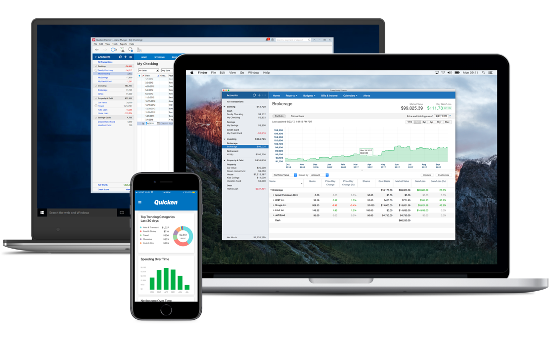
Quicken, a household name in personal finance software, provides customers a complete view of their financial lives. Customers can see their net worth, categorize spending, track investments, and create goals placing them on the path to achieving greater economic freedom.
The purpose of this project was to improve product consistency and team productivity responsible for developing the Quicken product. How we would accomplish this goal is by creating a set of guidelines informing teams how to apply layout, color, typography, and icons in all our products.
Improving branding by having a familiar and consistent visual feel across our Windows, Mac OS, and mobile products.
Improve team productivity by taking the guesswork out of layout, typography, and color usage. Empowering teams to focus on developing UX solutions without the need to check past projects or recreate designs.
Improve customer delight by delivering higher quality product experiences as a result of having well-documented guidelines inside the design system available for all product and teams.
As the Lead Principal Product Designer, my role was to fulfill the project goals outlined above.
My role included:
Create and lead the design process.
Evangelizing design systems company-wide. Promoting benefits to the business, brand, product teams, and goals in creating the best possible user experiences.
Create and maintain partnerships with all designers in the company to support building the foundation principles to the design system.
Project manage the design systems creation by planning tasks, managing fulfillment, and organize ongoing discussions and reviews with designers, engineers, and product managers.
Collaborate with engineers and product managers for feedback and implementation.
Create agreements with the team for the implementation of layout, typography, color, iconography, and design documentation.
Work for this project was limited to 20% per week, as the design team was already in high demand supporting product development and marketing for an upcoming product release.
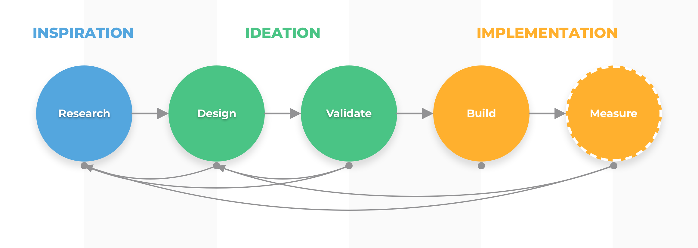
Time and project scope heavily influenced the design process: research, design, validating, and building. A project plan was created with time estimates to work within these constraints.
Key considerations for this project were time and resources, all of which were scarce. To support the teams’ efforts, I project managed and broken tasks down into small, easy to accomplish parts. This provided our work a consistent momentum with minimal impact on other design projects.
Completing a product audit was part of the process to create a deep-level understanding where the product was at the time. Here, we could identify common patterns, what was working, and opportunities for improvement.
Documenting early and often was a method used to track work on the system and identify tasks requiring more in-depth discussion by the team. This approach was effective at providing insight into the overall effort while the team was working on different parts.

Improve product consistency to build trust and credibility with customers.
Improve visual branding so that the product is recognizable across platforms and touchpoints.
Improve team productivity by having templated and reusable components available to support product development.

Consistent user experiences increase usability & user confidence and reduce confusion & frustration when interacting with the product.
Improve accessibility by having an intentional visual hierarchy, color contrast, and spacing.

Library adoption required co-ownership by the team in creating and sharing the work they’ve done.
Support for frameworks offered some implementation challenges. In one such case for a new product in development, we provided a limited rollout of the design system due to limitations with the development library we were using.
High adaptability of implementing the design system was necessary as the constraints of each product – hard coding, libraries – had us discussing workarounds with developers.

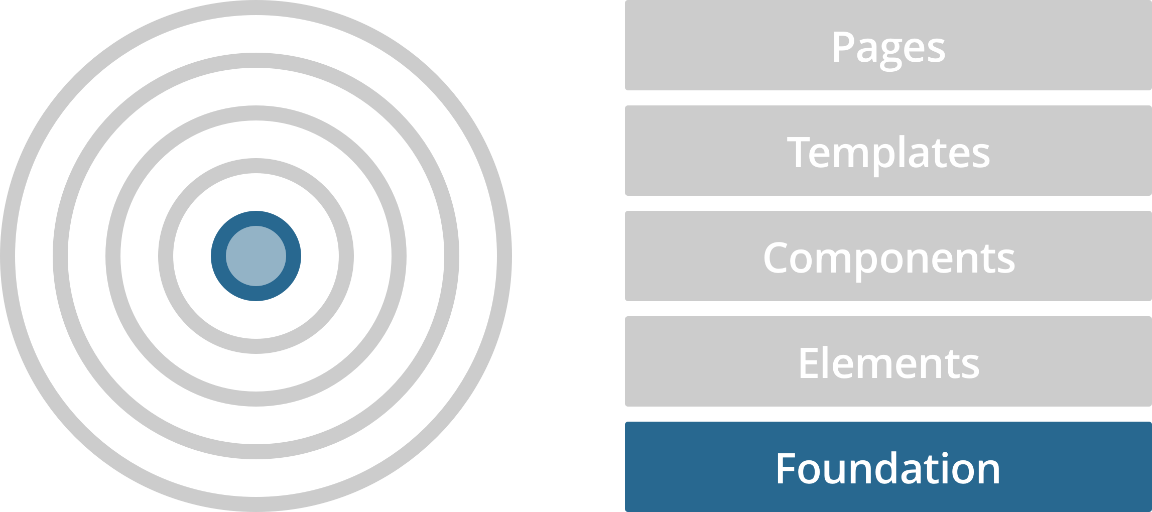
Start with a foundation. Founding principles guide design systems. So establishing guidelines to layout, typography, colors, and icons was essential.
Document guidelines. We documented our design system in confluence. As we were creating content, we checked our work for clarity with the team and provided opportunities for improvement.
Iterate early and often. We wanted to implement the design system as soon as possible. With this being a living document, having something good to work with was better than waiting to make it perfect.
We conducted an audit of all Quick products to understand how we were applying color throughout the brand. From that research, we discovered trends and created opportunities to provide intentionality to our use of color in future design projects.
The final result of the color system was a collaborative effort with the entire design team.
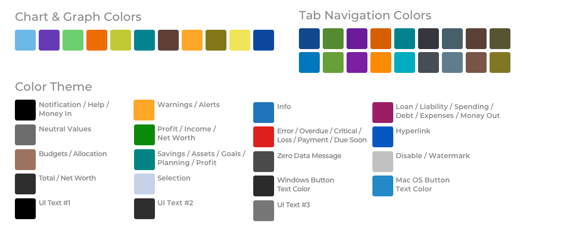
Desktop color system
One challenge was our product had a lot of interactions with data and data visualization to consider. Our Windows and Mac products also used different color themes. For our first iteration of the color design system, we started having six-to-ten tint/shade variations of each color, allowing an effortless transition to the new design system.
Color frameworks
With our new color library, we wanted to create meaning behind how we used color in our products. Drawing inspiration from sources like the Quickbooks Design System, we created a color framework to inform how we would apply color to transaction types and data visualizations.
Mobile color system
While developing the color system, the implementation with the mobile product wasn’t testing well. After evaluating the result with product managers, we found the mobile audience responded to color differently than our desktop audience. As a result, we created and tested a secondary color library for millennial audiences that responded well to their visual tastes.
Typography was noticeably distinct between our Windows and Mac products, from hierarchy and style to using Windows (Segoe UI) and Mac OS (San Francisco) system fonts. We wanted to create a new typographic system where styles and weights were visually consistent in all of our products.
Using our catalog of typography styles from the product audit and referencing interface guidelines, we created a typographic system with 13 styles to guide us.
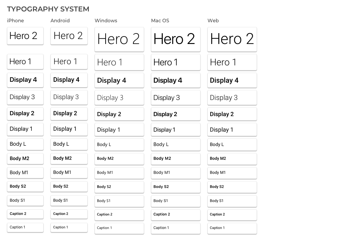
Mapping typefaces to create visual balance
We mapped the font families – Segoe, San Francisco, and Roboto – our products were using and compared font weights that worked well across platforms. Weights we found existing across platforms were added to the system and included in our guidelines.
13 styles of typography
When studying how to label the typography system, we looked to web standards and product interface guidelines set by Apple, Google, etc. Using labels such as Hero, Display, Body, etc. we settled on applying 13 styles that satisfied most of our design needs.
Mobile typography
Our mobile products had the same challenge of not having a typographic system in place to guide development. Once we were clear on the structure we wanted for our desktop system, we applied what was defined and created a new mobile typography system.
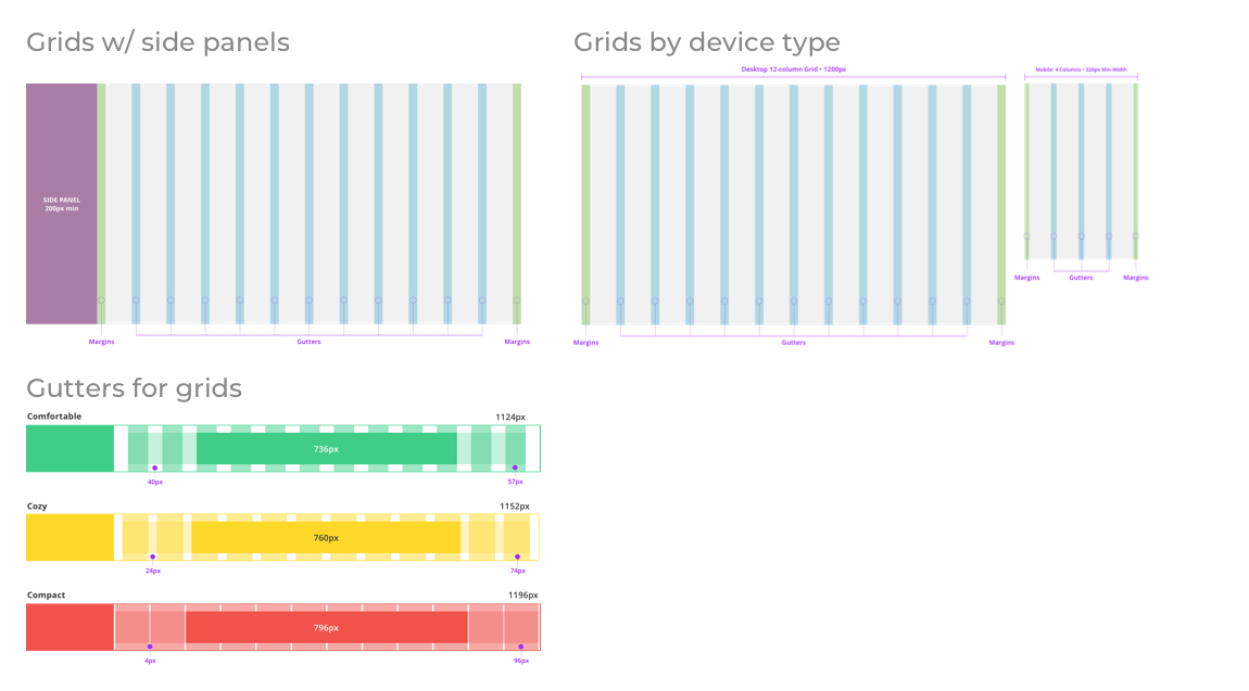
Creating guidelines on how to apply layout and spacing rules in our product design had its challenges when we elevated our existing workflows. Its success depended on the teams agreement to adopting the same set of rules we would design with going forward.
One method supporting this goal was applying existing frameworks into our design system. Well defined and documented frameworks, such as 8 point grids and space systems, which were familiar and trusted by the team.
The core challenge to adopting this part of the design system rested with reshaping workflow behavior without unnecessarily restraining personal expression by the team.
Designing in 1x
During development of the design system, we discovered some designers were creating in 2x because of the product area they designed in. To create a consistent platform all of our designers can work from, we created a design in 1x guideline to use in our workflow and pattern libraries.
Adaptive grid systems
Grid systems didn’t exist in our workflows before. As a result, I created grid systems for desktop, tablet, and mobile designs. Desktop grid systems also included sidebars with additional rules for how to design with them.
Spacing frameworks & guidelines
How patterns were spaced in our workflows largely depended on the style of the designer, which sometimes made developing those designs challenging during handoff. The opportunity here was to provide designers and developers a guide to communicate from, so a framework of spacing guidelines was created to serve this need.
We use icons heavily in our products. After completing our product audit, we got clear that the visual style and meaning we applied to them was not consistent across platforms. Having over 100 icons of various visual style, we realized creating this part of the system required a larger investment of time we didn’t have to complete on. We also started using illustrations in our designs for a while and wanted to see how we can incorporate them with our iconography.
Because of time and what we wanted to accomplish with this part of the system, we decided to place it on hold for a future phase when developing the design system.
Challenge: Icons
The icons we cataloged had a distinct look & feel that sometimes matched the platforms – Windows, Mac OS, iOS, Android – visual guidelines. While we wanted to have a consistent, branded library of icons the time and resources needed to complete this project was beyond scope; therefore, we placed the iconography project on hold.
Challenge: Illustrations
We used illustrations in our marketing channels and was exploring how to apply illustrations into our product design. We saw the possibility of having illustrations and icons working together and improve the brand. This exploration would put creating the rest of the system at risk of meeting our deadline; therefore, we placed this project on hold.
I like to work in close, regular communication with people across all disciplines who are responsible for the success of the project. For the design system project, I worked primarily with designers from our Menlo Park, CA, and Bangalore, India offices. I also collected feedback from the Head of Product Design, Product Developers, and Product Managers for additional insight and guidance around feasibility and adoption.
Some methods I used for this project were:
Collaborative Design Sessions
Depending on the team I was working with, this was accomplished in-person and with WebEx. This approach made a huge difference when developing our color and typography systems and how we can adopt them into our workflows.
Regular Check-ins
We checked in at least twice a week for feedback and to keep track of the project’s progress. Due to collaborating between Bangalore and Menlo Park, we traded night meetings to keep things fair. We also sent each other daily emails with thoughts and questions between workdays.
Collecting feedback with Invision
We used Invision to document project progress and get feedback from the design team, stakeholders, and any interested teammates. This approach made remote discussions easier and emails describing design changes unnecessary.