Quicken
Mobile Redesign
Design & Interaction | iOS & Android
Personal Finance | 2018
Quicken, a household name in personal finance software, provides customers a complete view of their financial lives. Customers can see their net worth, categorize spending, track investments, and create goals placing them on the path to achieving greater economic freedom.
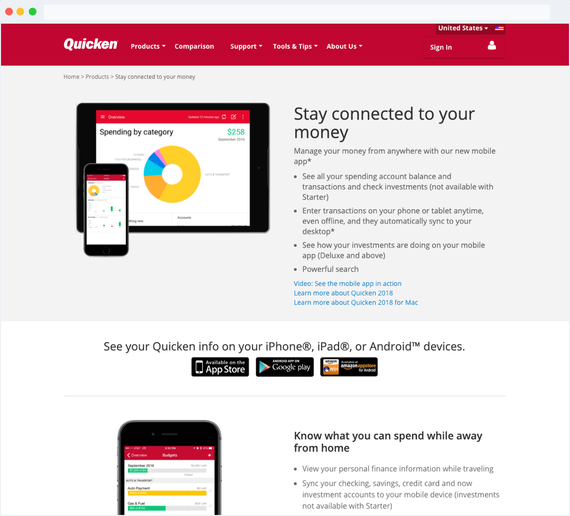
Quicken customers with an active subscription have access to a companion iOS and Android mobile app they can use to manage their finances away from home.
With this mobile app, customers can sync with the desktop app, enter transactions, and capture store receipts.
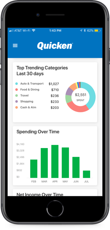
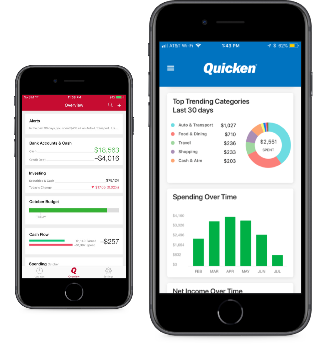
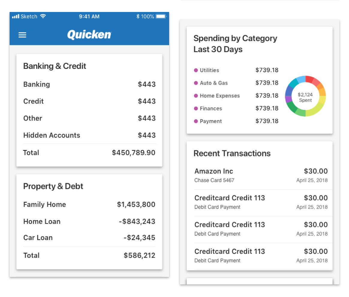
Additional features include viewing balances, accounts, and transactions. Customers can also see spending trends, transaction history, and check investment performance.
The Quicken Mobile app was a white-label solution created in partnership with Intuit. As a result of the separation from Intuit, this project was created to recreate the Quicken Mobile App as an independent personal finance solution.
Minimizing the customer impact as a result of this project. With the app being rebuild from the ground up, every area of the user experience had to be rebuilt as well. Time and resources was an important consideration to the success of the project.
Rebranding the mobile product with a modern vision. The opportunity was available to rebrand the product so that it aligned with the future vision of Quicken Products.
I also helped guide design consistency using newly established brand guidelines/design systems across the project process.
To deliver on the project goals outlined above. My role included:
Collaborating timing with the lead product manager
Facilitating design sessions with key stakeholders
Collaborating with the design team
Creating mockups and visual design
Collaborating with engineers
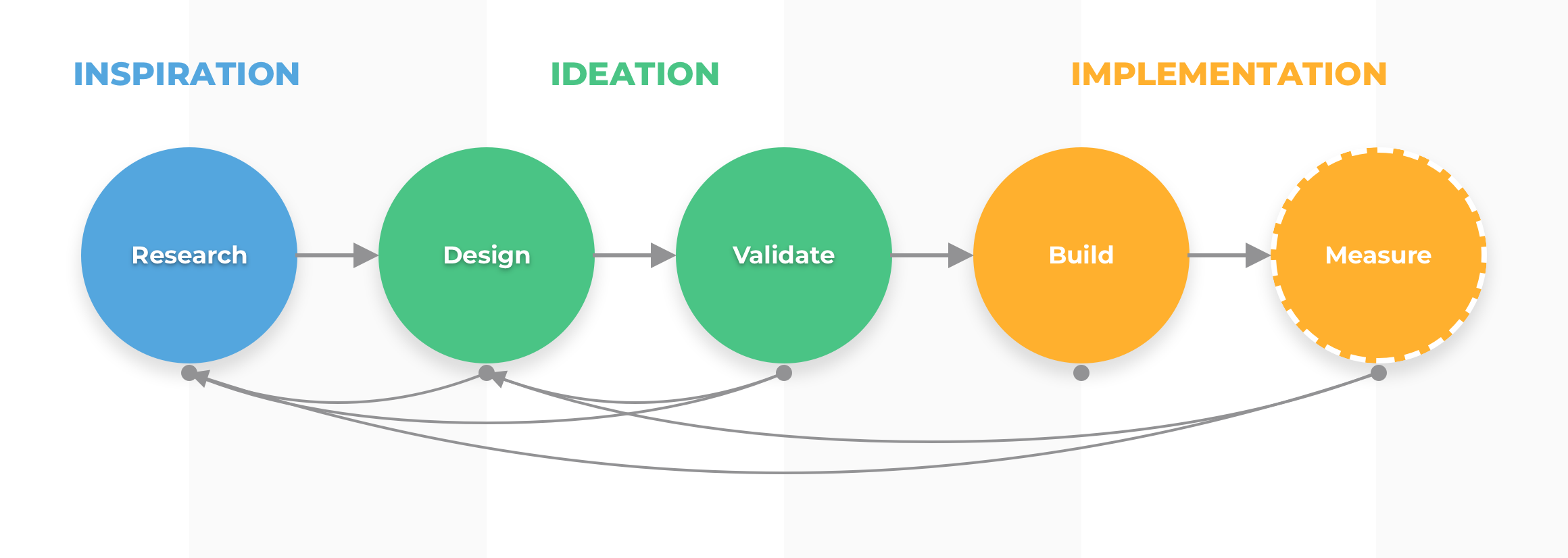
This project followed the fundamental characteristics of the design process: research, design, validating, and building. How much we invested in each step of the process varied due to the teams available resources to deliver on the goals.
The project scope and time available for the project heavily influenced the design process.
Some key considerations for this project were time, budget, and development resources, all of which were scarce. The business and development requirements were being defined as the project progressed (which can happen at a startup!)
My goal was to ensure the product experience was consistent. With a lot of contributors to the project, it was important to have select members of the team holistically evaluate design & development work regularly so the user experience was not disruptive to customers.
Learning and adapting quickly according to new and changing requirements was important to minimize blocking any other team from accomplishing their goals.

Clearly see and understand their financial summary from the dashboard
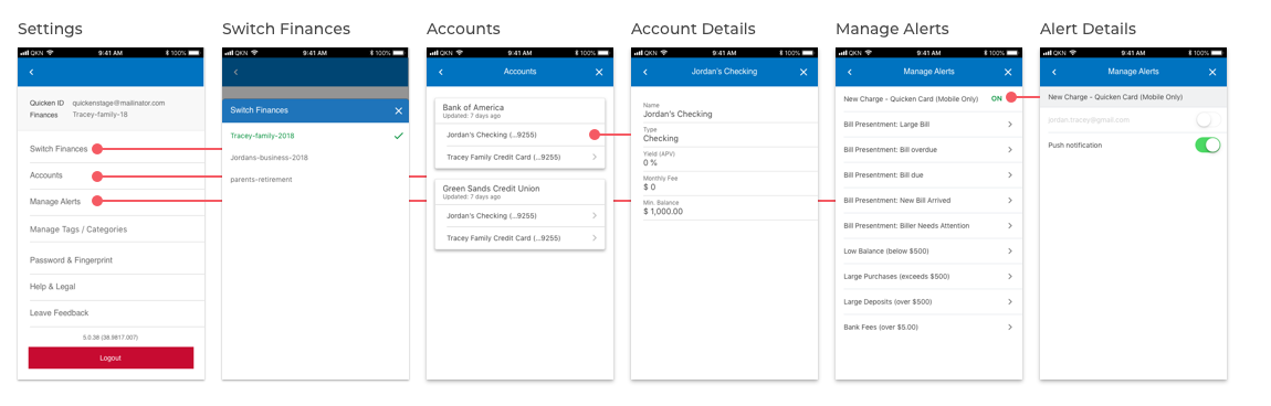
Ability to resolve connection errors with linked accounts
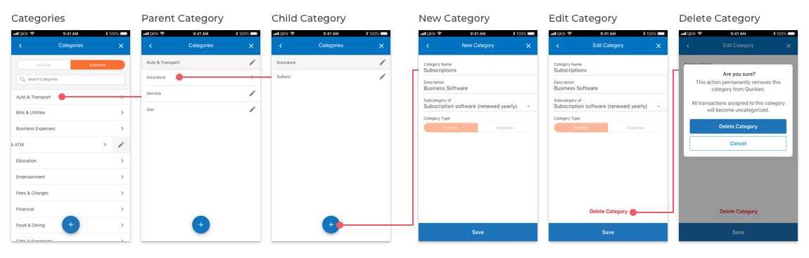
Ability to easily customize tags, categories, and category groups

Minimize development time. As time was scarce, it was important that developers were clear on what was being built and how it worked. The goal was to design reusable patterns for the MVP solution and future releases.
Minimize complexity. Avoid using fancy screen transitions or animations, which take up considerable development time.
Utilize responsive design. This was to accommodate the fact we were also planning to release a tablet version of our companion product.

Most competitors offered a similar user experience. Account summary, account details, and listing transaction all used similar patterns. Product differences were visual branding.
Staying simple with progressive disclosure. Most of the mobile apps surveyed kept their entry points simple. Once users decided where they wanted to go, the experience displayed richer content to meet that interest.
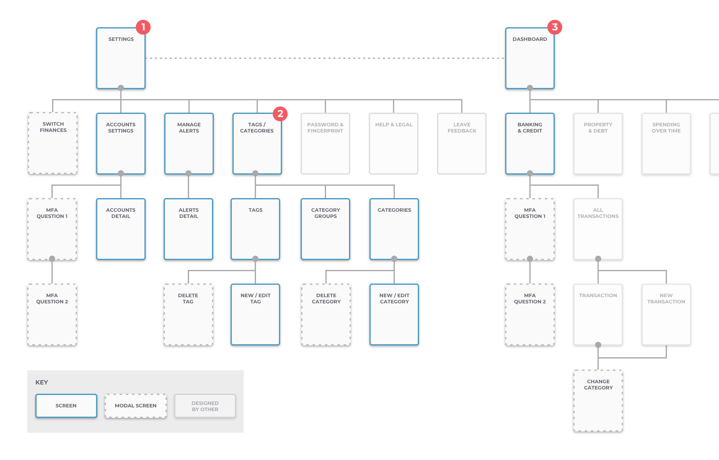
Designers and developers worked on different areas of the app to build it up quickly. The draft of the user flow was helpful to get an idea of what screens I needed to design for.
I also worked closely with the PM to discuss ideas. We decided that:
Approved designs would be uploaded into Zeplin. Zeplin was a better choice for us to coordinate final designs with the Bangalore based development teams. We created different project buckets and marked what was 'in progress' and 'ready for development' so teams knew where to work from.
Design directly in mid- to high-fidelity mockups
Because we had a well defined style guide to work from, I saved time by not designing black + white wireframes and used already created patterns in its place.
Create designs that would work for both iOS and Android
I considered using the design patterns found in both iOS and Android interface guidelines to ensure all designs were usable.
Use short and concise micro-copy and messaging
This was important for the use cases where there was an error connecting to an account. I believed explaining in detail why the error occurred would slow users down from taking actions to correct the problem.
Component-based design
Instead of creating interactions that added complexity to the mobile app, we opted to create additional screens we could template and use throughout the app.
Minimizing complexity
We experimented with two approaches, one being a drop-down like interface and found that approach made the screens look very busy like. So instead, we went with a drill-down approach that was simpler and allowed for quick changes to be made.
Using the mobile design system
We were in the advanced stages of building out our design system while working on this project. Using what we learned to help establish our mobile guidelines and deliver a product having a holistic and consistent visual experience.
Design hand-offs were done using Zeplin, where developers could use the inspector to view design specifications.
Collaborative design sessions, so PM’s and engineers had an early input into designs.
Daily standups, to discuss progress and identify blockers.
Designs were uploaded into Zeplin. Zeplin was a better choice for us to coordinate final designs with the Bangalore based development teams.