Quicken
Customer Care Redesign
Interaction & Visual Design | Adaptive Web
Personal Finance | 2018
Quicken, a household name in personal finance software, provides customers a complete view of their financial lives. Customers can see their net worth, categorize spending, track investments, and create goals placing them on the path to achieving greater economic freedom.
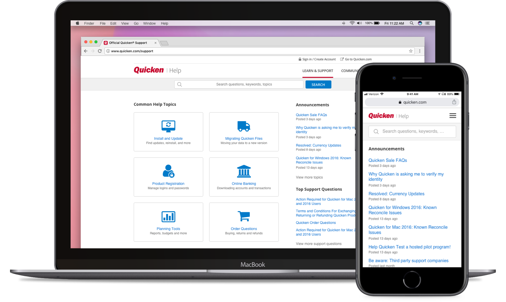
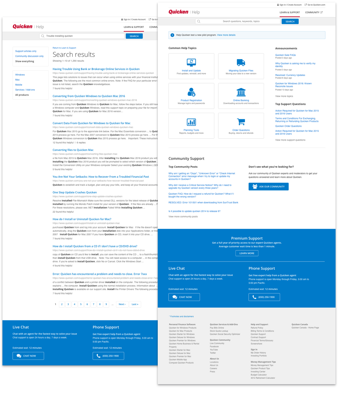
Quicken customers can visit the official support website and search for solutions to purchasing, installation, file migration, downloading transactions, and more.
In addition to customers finding solutions to common problems with self-help articles and community support, they may also call upon live-agents for additional support.
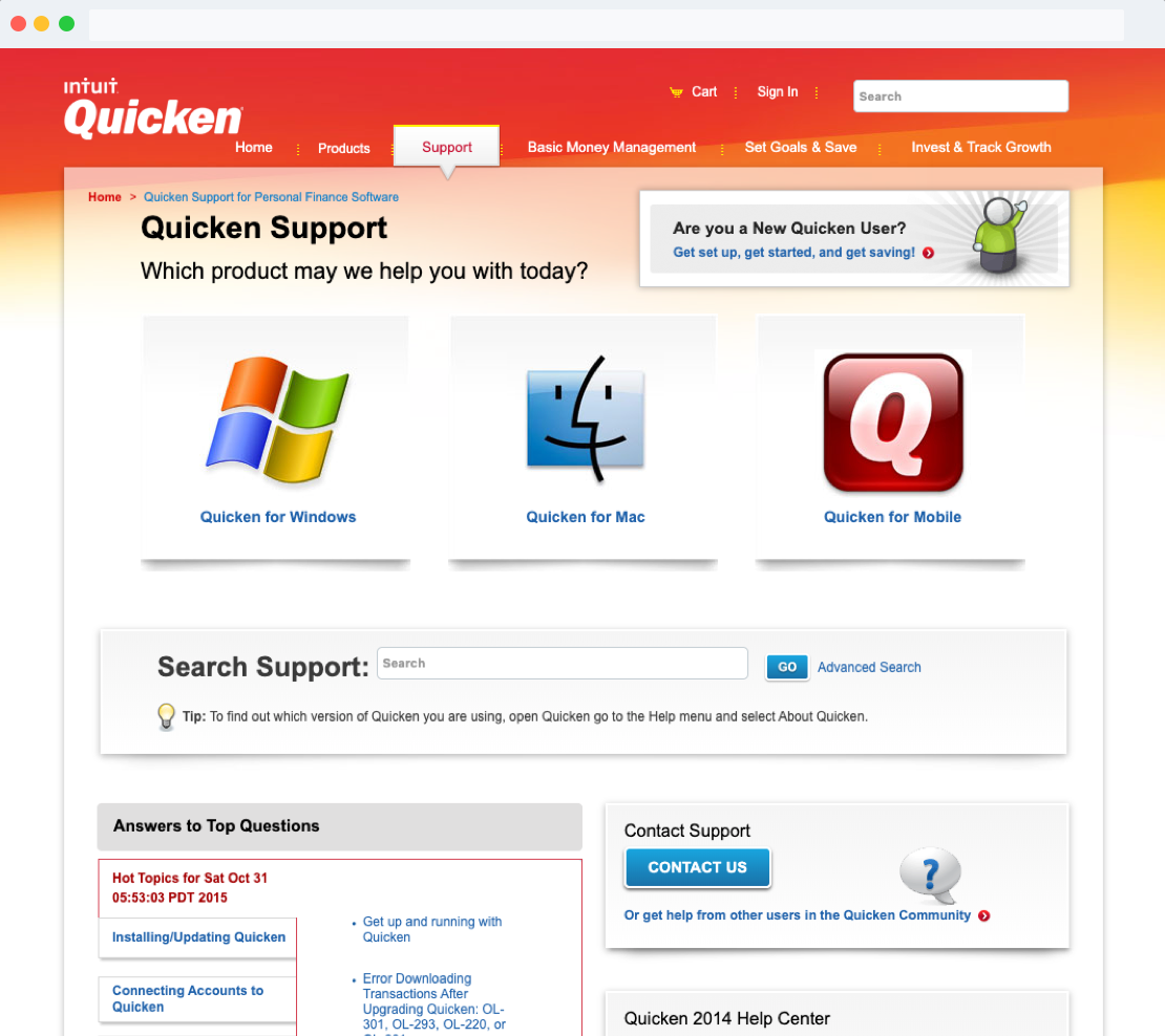
While this project was starting, Quicken, formally with Intuit, was transitioning to being a private company. As a result, customer-facing experiences, such as the customer support website, had to be recreated to fit with new platforms.
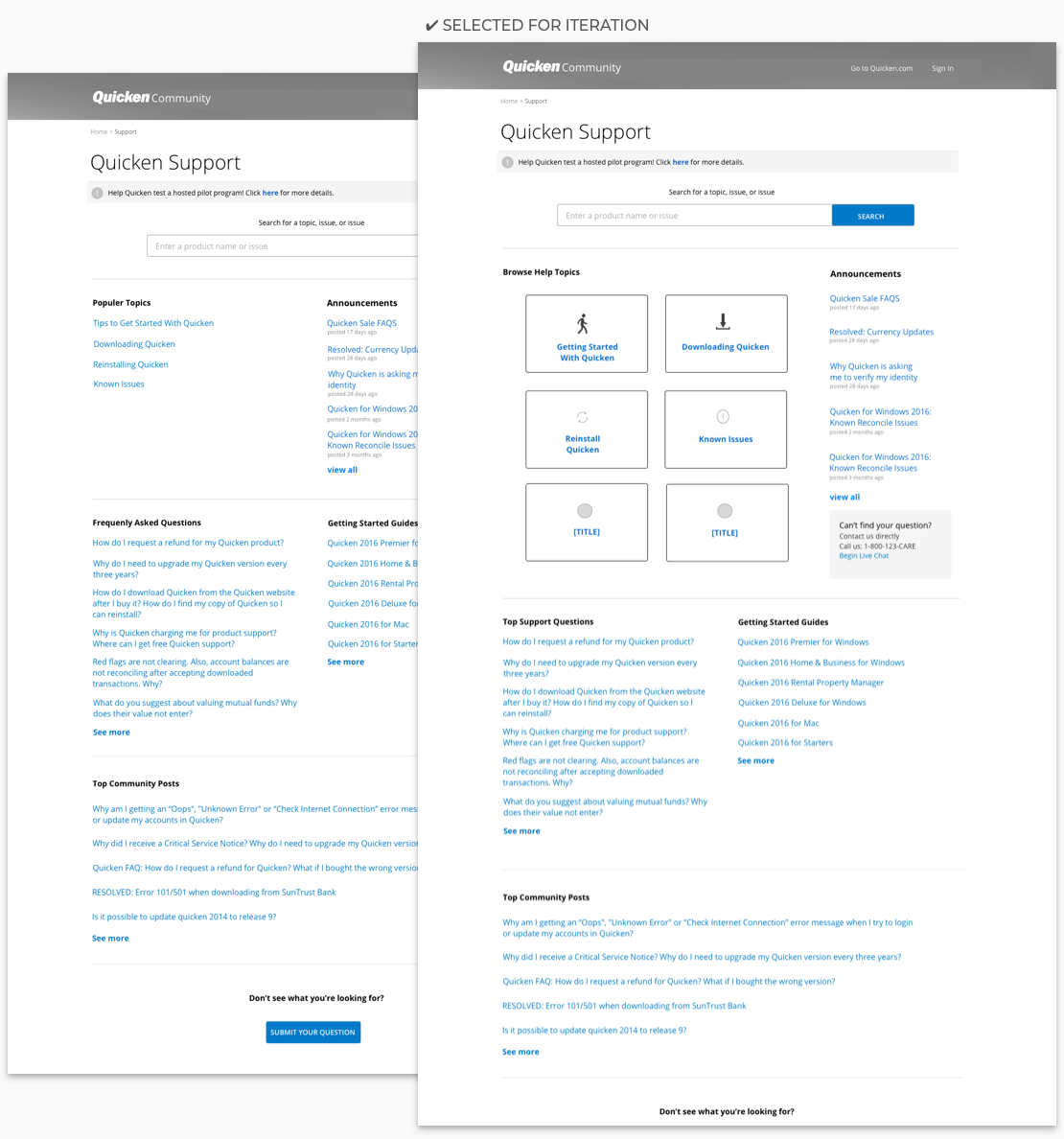
The customer success website was outdated and off-brand, therefore a redesign was requested as an opportunity to modernize and improve the websites user experience.
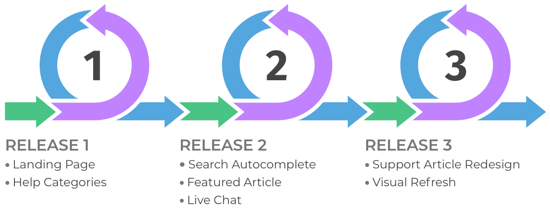
To accomplish our goal of reducing costs, we would regularly evaluate and identify opportunities to improve the user experience after each release.
As the Principal Product Designer at Quicken, my role was to deliver on the project goals outlined above. My role had included:
Work closely with remote-based stakeholders from Tuscon, AZ, to review data/research and discuss strategy, business opportunities, and design solutions.
Collaborate with remote development teams based across the U.S. using Invision, WebEx, and email to review and implement design solutions.
Review our design work with product design and marketing teams to test the user experience, collect ideas, or identify dev limitations.
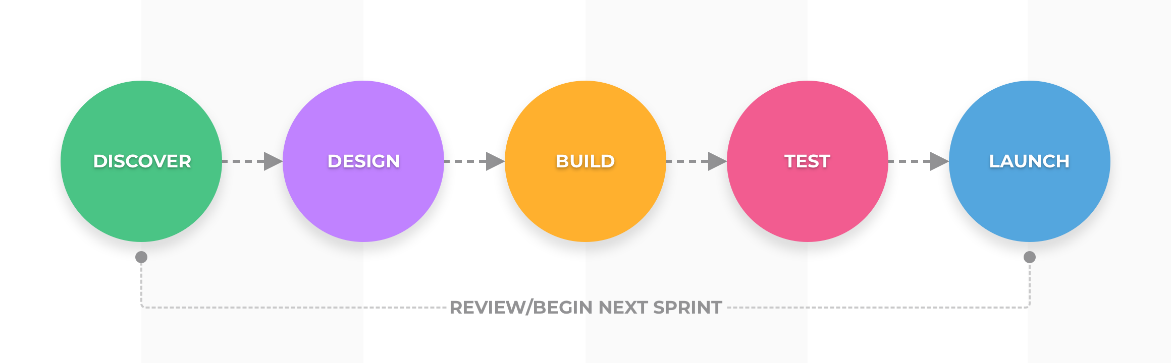
Design processes are methodical structures where the steps are adaptable to meet the needs of any project. Using an agile driven design process for this project, the steps used are: scope, research, design, build, test, and release.
Key considerations to this project were time and development resources, which were limited. We made it a goal to have our solutions effortless and straightforward to implement by development. We checked in on our fulfillment of that goal during every design review.
Using a "just enough design" approach had us stay lean in the process. It also offered room for contingencies to design changes in future dev cycles that come from usability testing recommendations.
Learning and adapting our approach according to new and changing requirements was a part of our process. Before starting a new project iteration, we evaluated the success of the previous project with gathered site metrics and customer feedback.

User interviews were conducted to understand their needs and goals. The following points emerged as the most important:
Guiding customers to using the support site. When customers aren't sure how to describe the problem, features such as topic categories or auto-populated search terms guide customers in the right direction.
Allow users to find matching support articles by release year, platform, and product edition. The product was released yearly with five editions and a 3-year license. Therefore, support articles must match the correct product edition.
Allow customers access to live-agent support. When a customer cannot find a matching article or get stuck, live-agent support-by phone or chat-provides additional care to having a satisfying customer solution experience.

Ability to browse help topics by category. Common help topics: Install and update, migrating files, product registration, online banking, planning tools, order questions.
Include an "auto-complete," feature in search, helping customers discover a matching solution to their problem. If customers are unclear about how to describe their issue, show possible help topics by using their entered search string to guide them through the support experience.
Ability to guide customers in resolving issues while phoning support. When customers begin to contact support and describe their problem, show them a listing of possible solutions while waiting for live-agent help.
Ability for customers to rate the effectiveness of solution articles. Customers rating solution articles improve the rate more customers will resolve that issue on their own. For ineffective articles, provide an opportunity for feedback to learn how we can improve that solution article.

Minimize development time. As time was scarce, it was important developers were clear on what we wanted to build. The goal was to design for pattern re-use between the initial launch and iterative launches that followed.
Minimize complexity. We refrained using any design visualizations not essential to the experience. One element we added was OS detection javascript to guide customers to the platform landing page of the support website.
Use responsive design. So we can provide the best user experience possible to customers using any device.
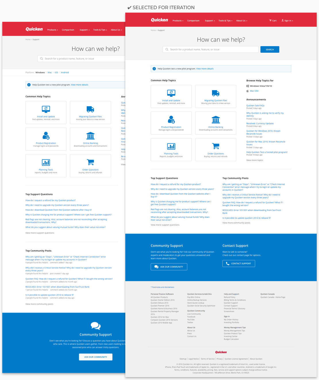
We decided to place search just below the header, allowing customers to start searching for matching solutions right away.
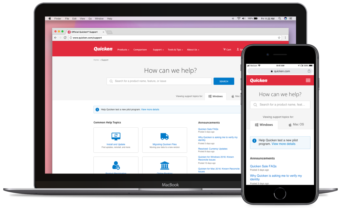
While navigating the site, we needed to clearly and loudly communicate the platform the articles were created for, as some customers assumed it was for their product.
To create familiarity with customers, we adopted and built upon the same style guidelines used for Quicken.com. This decision provided customers added familiarity being on the Quicken website while working within limited time and resources available to the team.
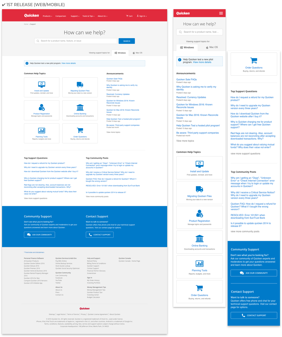
Deliverables were created for the desktop web, with mobile web designs being included shortly after the first public release.
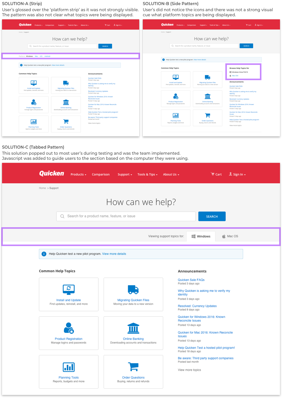
We discovered customers, when searching for matching solutions, missed the platform the solution article was addressing. To overcome this pain point, we added javascript to detect and redirect users based on their OS platform to the appropriate support category and matching solution articles.
To address an edge case, we added tabbed navigation to filter between Windows and Mac OS articles. This way, customers can browse solution articles based on their preferred platform.
Work was done remotely - using Webex, Hipchat, and email - with the customer success and development teams.
Designs were posted into Invision to gather feedback and discuss changes. Conversations were facilitated using WebEx or email to discuss design solutions and overcome challenges.
I worked closely with developers throughout the design process; walking the team through the design solution, answering questions, and QA’ing work before a production release.
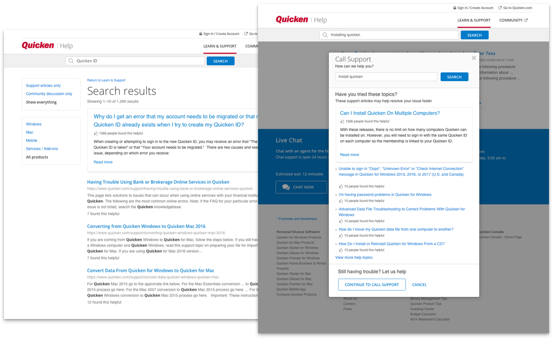
After releasing the first version of the new customer success website, we discovered an opportunity to improve the search results page. The problem was support articles & community pages were not distinct from one another, which impacted the self-help experience and more customer calls with live agents. What we did to solve for this problem was:
We added a new pattern featuring a popular article above the search results, based on search entry by the customer.
We also included this pattern in the call customer support experience. That way, while customers are waiting for a support agent, they can continue exploring matching solutions to resolve the problem on their own.
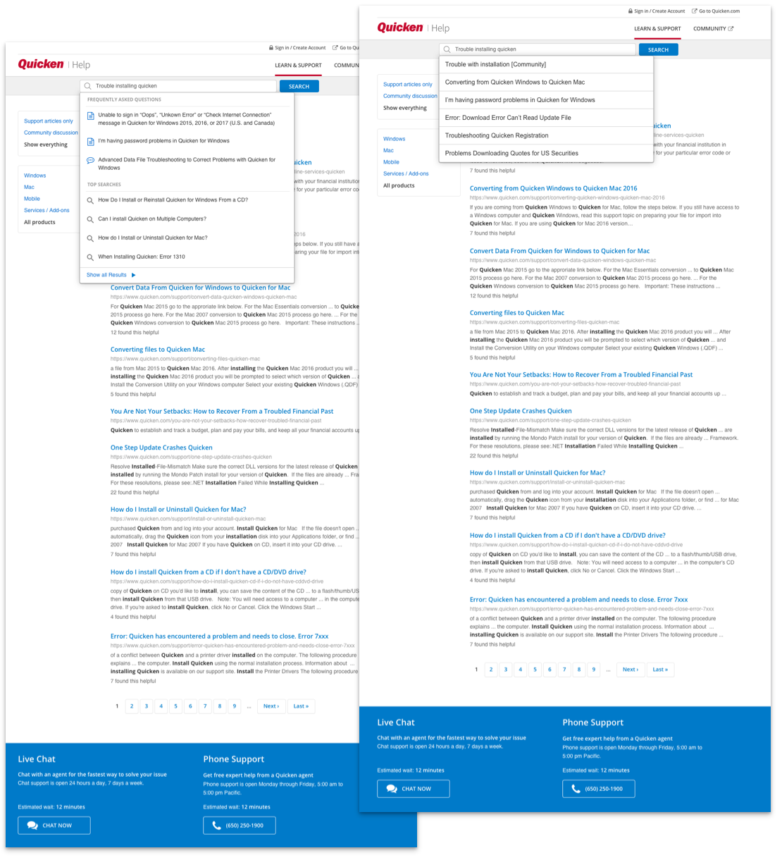
After launching the new customer success website, we looked into how we can reduce search errors and improve the self-help experience. That inquiry led us to create a few key improvements:
I added an autocomplete feature designed to make it faster for users to complete their search by adding "predictions" to words and search strings.
I added icons to distinguish between articles and community posts displayed in the search results. Top searches were also added to assist customers in resolving common problems.
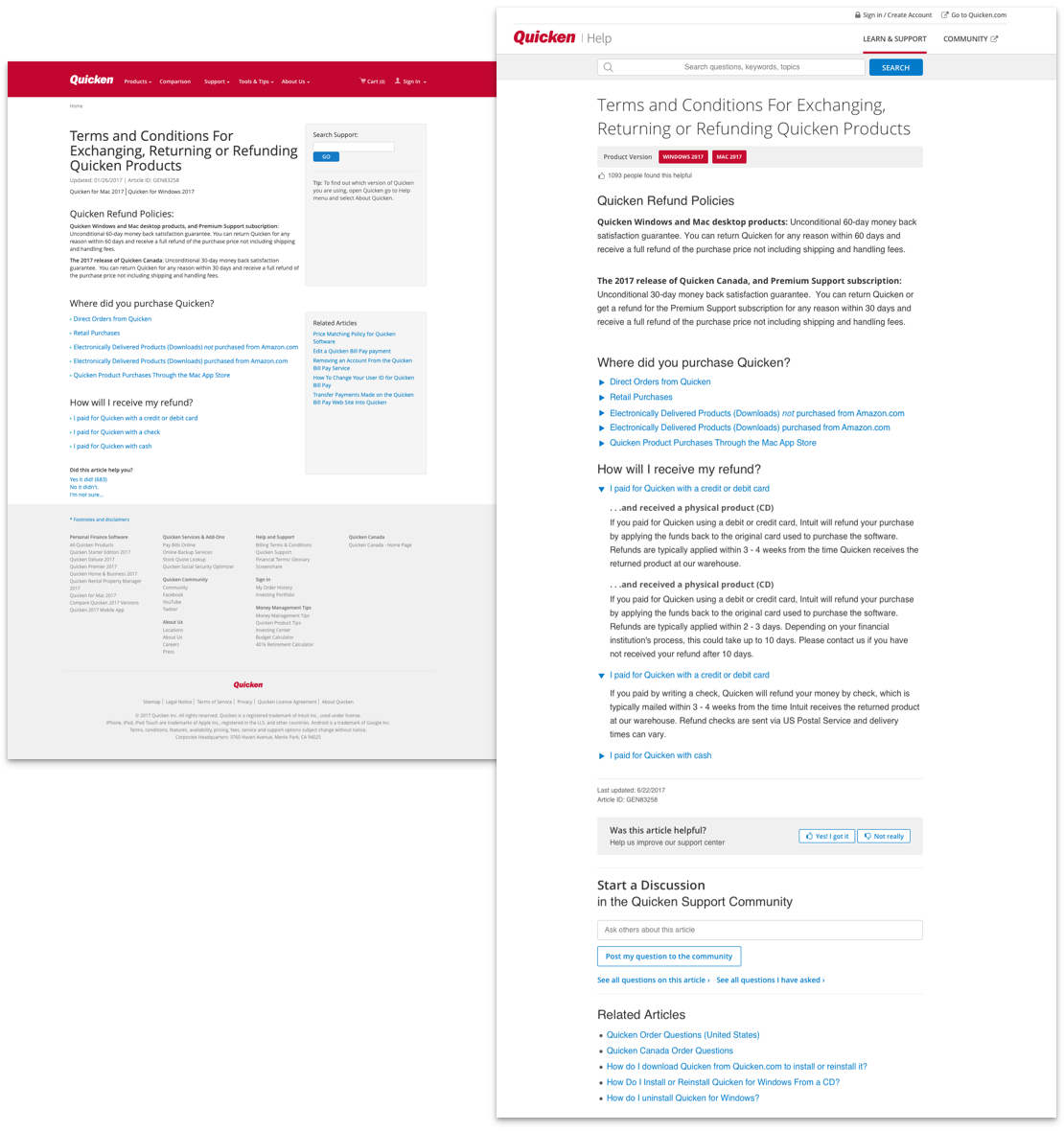
When launching the customer success website, the support article layout was left unchanged. It wasn't until we started gathering data and interviewed customers that we discovered parts of the support article experience was not working as well as intended. What was done to address that was:
Layout redesign. Discussions led us to use a single-column layout. The benefit of this decision allowed customers more content above the fold to scan. We also added a product version strip with sharp color contrast to guide customers to verify the support article matches their product.
New feedback interaction. The original pattern offered customers three options to rate the quality of the support article (yes, no, not sure,) then select from a list of seven reasons why and add ideas on how to improve it. Our solution to this was to reduce and rewrite the number of options for clarity. We also iterated on the Ul so that it stood out when navigating to the end of the article.
While working on the customer self-help project, I suggested reviewing the visual layout of the site and how our use of color, typography, and spacing was contributing to the user experience. The team and I evaluated the site, and the changes we made were:
Improved Visual Design / Style Guide. We increased the size of typography and reduced the weight to minimize the dramatic contrast between elements. We also reduced the amount of color we were using so that it was not distracting users away from reading the article content.
Revised Customer Success Header. The headers red background elicited strong reactions for people, so it made sense to replace this pattern and have the brand logo red instead. This reduced the stark contrast to the page. We also replaced the navigation links with those specific to the support site. Lastly, we eliminated space around the search field to allow more space for content. After introducing the new header pattern, it then adapted for use across the Quicken web experience.